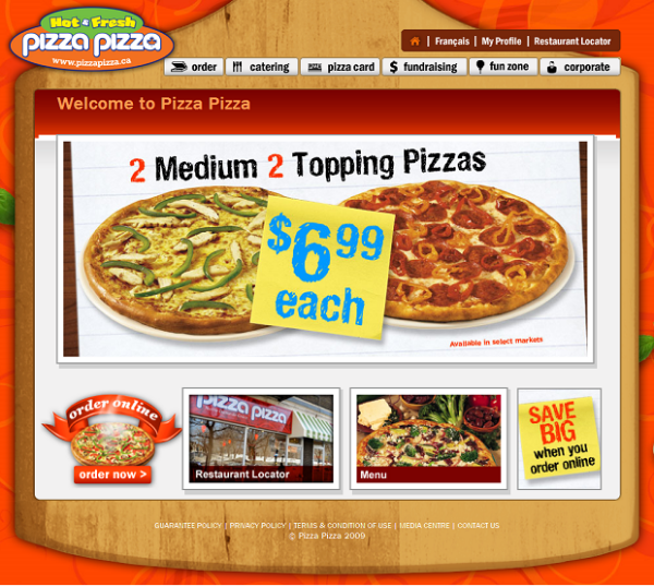
I don’t eat pizza often, let alone place orders for pizza delivery. My brother decided we would have pizza tonight so he asked me to check out Pizza Pizza’s website. Keep in mind that I seldom visit websites of fast-food establishments, simply because I mostly browse the websites of design firms and magazines for web design inspiration. So you could imagine my surprise when I found out that one could place an order for pizza through the internet.
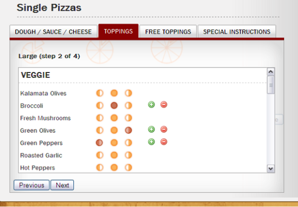
What I find fascinating is that the interface combines some of the standard GUI elements with context specific ones as shown below.
It didn’t immediately occur to me that one could customize the pizza to have different combinations of toppings on each half of the pizza. While it took me a few seconds to realize this, the interface made sense to me eventually. You can choose to apply a topping to the left half (by selecting the left icon), the right half (by selecting the right icon), or both (by selecting the middle icon). Part of my confusion might have been because I don’t order whole pizzas on a regular basis, so it may well be the case that this interface is in fact intuitive for its target audience.


1 comment:
Haha, you need to eat pizza more often, its good for the soul!!
Post a Comment